• Skip to primary navigation
  • Skip to main content
  • Skip to primary sidebar

John August

  • Arlo Finch
  • Scriptnotes
  • Library
  • Store
  • About

flagged

Clueless at Outfest

June 14, 2010 News

I’ll be hosting a screening of Amy Heckerling’s CLUELESS at LA’s Outfest 2010. It’s one of my favorite movies of the 90s, but some might wonder if it’s gay enough for the festival.

I would argue that…

True to its title, CLUELESS doesn’t know how gay it is. Amy Heckerling’s 1995 clever reworking of Jane Austen’s Emma gives us Alicia Silverstone as the stylish but shallow Cher Horowitz, whose well-intentioned meddling leads her to deeper revelations about friendship and forbidden love — her ex-step-brother, the dreamy Paul Rudd. Along the way, she falls for the gay guy, pursues the jerk, and gives her soul a makeover. CLUELESS is a blast of queerjacent sunshine.

Catch the Clueless screening July 11th at 4:45pm at the DGA. Tickets are $13 — but much cheaper if you become a member.
Same site, new metal

June 8, 2010 Geek Alert, Meta

You’re reading this post on the new server Ryan transitioned us to over the weekend. It should be much, much faster.

Nothing in the site has been redesigned yet — that’s still a few weeks away. I wanted to hold off the transition to a new host until we were ready to unveil the revamp, but load times got to be incredibly slow, and the old provider couldn’t provide any explanation or solution.

If you come across anything that got broken in the move (something that worked last week, but doesn’t this week) please leave a note.

Academy’s Film Noir series

April 19, 2010 Genres, Los Angeles, News

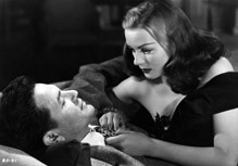
noirThe Academy is hosting a Monday night screening series focusing on film noir:

Fifteen film noir classics from the 1940s, all of which were nominated in the writing categories, will be celebrated in a summer-long screening series, introduced by contemporary screenwriters whose own work reflects the film noir style.

I’ll be handling “The Dark Mirror” on July 12. (Olivia de Havilland! Twins! Murder!)

It’s a unique chance to see these films on the big screen, with terrific prints.

Date Film
May 10 “The Maltese Falcon,” introduced by Lawrence Kasdan
May 17 “Shadow of a Doubt”
May 24 “Laura,” introduced by Scott Frank
June 7 “Double Indemnity,” introduced by Nicholas Meyer
June 14 “Mildred Pierce,” introduced by Callie Khouri
June 21 “The Killers,” introduced by Billy Ray
June 28 “The Strange Love of Martha Ivers,” introduced by Robin Swicord
July 12 “The Dark Mirror,” introduced by John August
July 19 “The Blue Dahlia,” introduced by Wesley Strick
July 26 “The Stranger”
August 2 “Body and Soul”
August 9 “Crossfire,” introduced by Brian Helgeland
August 16 “A Double Life”
August 23 “Kiss of Death”
August 30 “White Heat”

Tickets are $5, or $30 for the entire series. It may sell out, so if you’re interested, reserve now.

What’s the big deal with fonts?

April 16, 2010 Random Advice

questionmarkWhenever “you people” go off about fonts, I feel like someone’s AM-radio-loving grandpa trying to read SPIN magazine.

Can you tell me why some fonts are considered beautiful, others ugly? By what standards are they typically judged? Why do people hate Comic Sans and Arial?

— Mike
Toronto, Canada?

random adviceEasy answers first. Arial is widely condemned as a bastardization of Helvetica, a typeface so beloved you can watch a whole movie about it.

Comic Sans, like Zapf Chancery before it, enabled ordinary people to make extraordinarily ugly signs and newsletters by using it inappropriately. That’s why designers hate it. ((To be fair, if you read the backstory of Comic Sans, you’ll see it was created for a specific purpose, then went viral.))

Typefaces are a lot like clothing.

You need clothes to protect you from the sun and cold, and to keep people from staring at genitalia all day long. You need typefaces so people can read written works and signage.

There are important functional aspects to designing and choosing type, and good arguments to be made for why certain faces are appropriate in certain circumstances. You wouldn’t want to read a novel in Highway Gothic. You wouldn’t want street signs painted in New Century Schoolbook.

But beyond the extreme cases, typography is largely fashion. And you’re always welcome to not care about fashion.

« Previous Page
Next Page »

Primary Sidebar

Newsletter

Inneresting Logo A Quote-Unquote Newsletter about Writing
Read Now

Explore

Projects

  • Aladdin (1)
  • Arlo Finch (27)
  • Big Fish (88)
  • Birdigo (2)
  • Charlie (39)
  • Charlie's Angels (16)
  • Chosen (2)
  • Corpse Bride (9)
  • Dead Projects (18)
  • Frankenweenie (10)
  • Go (29)
  • Karateka (4)
  • Monsterpocalypse (3)
  • One Hit Kill (6)
  • Ops (6)
  • Preacher (2)
  • Prince of Persia (13)
  • Shazam (6)
  • Snake People (6)
  • Tarzan (5)
  • The Nines (118)
  • The Remnants (12)
  • The Variant (22)

Apps

  • Bronson (14)
  • FDX Reader (11)
  • Fountain (32)
  • Highland (75)
  • Less IMDb (4)
  • Weekend Read (64)

Recommended Reading

  • First Person (87)
  • Geek Alert (151)
  • WGA (162)
  • Workspace (19)

Screenwriting Q&A

  • Adaptation (65)
  • Directors (90)
  • Education (49)
  • Film Industry (489)
  • Formatting (128)
  • Genres (89)
  • Glossary (6)
  • Pitches (29)
  • Producers (59)
  • Psych 101 (118)
  • Rights and Copyright (96)
  • So-Called Experts (47)
  • Story and Plot (170)
  • Television (165)
  • Treatments (21)
  • Words on the page (238)
  • Writing Process (177)

More screenwriting Q&A at screenwriting.io

© 2026 John August — All Rights Reserved.